HEBREW ALPHABET USED IN WRITING STA"M
( Sifrei Torah, Tefillin, and Mezuzos )
There are over 150 laws concerning how the Hebrew Alphabet must be written by the Jewish Scribe. Here, each letter has been scanned in separately, to point out some of the things to look for in good writing.
Note: This is only a reference and is by no means complete. Please check your STA"M with a competent certified Sofer. Ask your Sofer if he is certified by the Vaad Mishmeres STA"M.
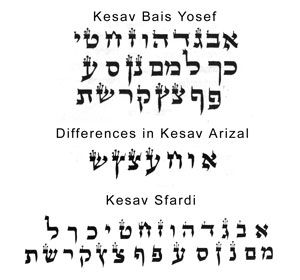
For the purpose of this document, this deals only with the Beis Yosef's opinion on how the letters should be written. There are several letters where the Ari Z'al has a difference of opinion, as seen below.
The Remah in the beginning of Hilchos Tefilin quotes from the Rishonim: "It is a Mitzva to beautify them from the inside and the outside". It's obvious that if one letter is big while the next letter is small, this is not called "beauty". It does not have to be a piece of art, it rather means that it should be at least a decent consistent handwriting, besides having the technical halachic requirements. In the cheaply written Tefilin & Mezuzos, this is not the case, and although halachacly Kosher, an upgrade in the general look of the Kesav is recommended.
What is Kesav Bais Yosef, Arizal, Sfardi?
There are basically four different Minhagim on how to form the letters of the Alef- Bais. It should be noted that Rabbi Chaim Vital writes in his Sefer Sha’ar Hakavanos, that he asked his Rebbe the Arizal about the differences in the various Minhagim of writing, and he answered that they are all true and authentic, and all have deep meanings according to Toras Hanistar.
(1) Kesav Bais Yosef:
This is the basic Kesav which the Bais Yosef explains in detail in his commentary on the Tur Shulchan Aruch Orach Chaim Siman 36.
(2) Kesav Arizal:
This is generally the same as Bais Yosef besides seven letters which are slightly different. The main differences being the letters Ches & Tzadik. There is a debate among the followers of Minhagei Arizal whether he meant to institute these differences only by Tefilin, or did he mean in all areas of STAM. Most people today who consider themselves Chasidim, meaning that they follow Minhagei Arizal, will insist on Tefilin being written according to Shitas Arizal. On anything else, meaning Mezuzos, Sifrei Torah, Megilos, they would prefer Kesav Arizal, but would not insist on it, because his emphasis was mainly on Tefilin. Some Chasidim make sure to have only Tefilin Kesav Arizal, being of the opinion that the Arizal himself held that everything else besides Tefilin should be written Kesav Bais Yosef.
(3) Kesav Sfardi:
This is the Minhag of the Sfardim, which is also called Kesav Vellish. Besides certain letters being written differently, it is also different in style. This Minhag is explained in detail in The Sefer Ledovid Emes from the famous Chida, and in the Sefer Kol Yakov from the Kaf Hachaim.
(4) Kesav Chabad:
This Kesav which is also called Der Alte Rebbe’s Kesav alluding to the first Rebbe of Chabad Rabbi Shneiur Zalman, famously known as the Ba’al Hatanya, is basically the same as Kesav Arizal but the letters are a little different in style. The Batim in Tefilin are also larger in size then the average Tefilin due to a different interpretation of the required dimension. The Kesher Shel Yad is made differently as well.
Note that there is also an exceedigly rare 4th style as well - a derivative of the Ari Z'al script called the Alter Rebbe's Ksav (Ksav means writing style) that is unique to the first Lubavitcher Rebbe of the Chassidic tradition. It is somewhat similar to Ari Z'al Ksav, but with the Alter Rebbe's modifications. Please understand that there is no original of the Alter Rebbe's script and there are, as a result, variations of opinion over what is the 'correct' version. Only a limited number of Lubavitcher sofrim feel they 'have it' and choose to write this ksav, and they are NOT all alike. Some rabbonim even at Chabad actually prefer straight Ari Ksav, since there is a clear, black-and-white, handed down version of that ksav and it is guaranteed 100% kosher to all schools.
Only consider the Alter Rebbe's ksav if you are willing to depend on the sofer's knowledge and realize that some other sofer, when inspecting the writing, might prefer another variation. Also, it is highly recommend that you only have them checked by a Lubavitcher sofer, as many non-Lubavitcher sofrim might have never seen this ksav, and certainly not be knowledgable enough to inspect them.
Letter Aleph

The Letter Aleph has 3 distinct parts and 10 laws concerning its form. There is an upper Yud, a lower Yud, and a body that is similar to a Vov. There should be a clear connection from the body of the Aleph to the Yuds but none of the faces of the Yuds are allowed to touch its body. The face of the upper Yud should be slightly angled upward. The very bottom end of the Vov part should be slightly turned upwards. The size of the Aleph should be 3X3 kulmusim.
Note: The word Kulmus(im) means the width of the tip of the quill.
Letter Beis

The Letter Beis is made of 3 parts. The size of the letter is 3X3 kulmusim. The space in the middle of the Beis should be exactly equal the width of the top and bottom lines, which is 1 kulmus.The Beis should have a small heel coming out of its back on the bottom, so that it is clearly distinguished that it is a Beis and not a Chof Kefufa. It should also have a single Tag (pronounced tahg) on top of its head on the left side. A Tag is a single, short line, which usually will have a "crown" at the top. (Click on the Beis to see it better. This Tag should not be on the very end of the left side, nor be made too large, or it can cause a number of different problems.)
Letter Gimel

The Letter Gimel has a head of a Zayin, and has a leg sticking out of it on bottom whose face points slightly upward. There should be three Tagin on its head. All of the corners of the head should be squared. The right leg should be slightly longer than the left one. The height of the Gimel should be three kulmusim. Originally, Sofrim made the Gimel with a long neck, so as to be able to put the top of the next letter near the head of the Gimel. Nowadays, we arch the back of the right leg slanting downwards towards the right, to avoid any problems and to create ample space.
Letter Daled

The Letter Daled has 2 main parts. There is a roof and a leg. If the heel which sticks out on the top right corner is missing, the letter is still kosher. We want there to be a heel sticking out so that the Daled is distinct from the Letter Reish. The roof should be 3 kulmusim long. There should be one Tag at the left end of the roof. (This Tag should not be on the very end of the left side, nor be made too large, because it can be a problem.) The leg should be slightly shorter than 3 kulmusim.
Letter Heh

The Letter Heh is basically a Daled which has an upside down Yud at the lower left hand corner, at an equal distance away from the roof as from the leg. The heel that was found on the roof of the Daled isn't necessary on a Heh, as even if the body looked like a Reish it would be kosher, but most Sofrim put a heel on top anyway. There should be one Tag at the left end of the roof. (This Tag should not be on the very end of the left side, nor be made too large, because it can be a problem.) Great care must be taken so that the left leg does not touch the roof of the Heh. If it does touch, even with an amount as thin as a hair, it would be invalid.
Letter Vov

The Letter Vov should be 1X3 kulmusim. The top right part of the Vov should be completely rounded, because if it's squared it would look like a Zayin. The face of the Vov should be straight up and down, not angled. Neither the head nor leg of the Vov should be made too long, because then it will look like another letter. (ie- a Reish or a Nun Peshuta)
Letter Zayin

The Letter Zayin should be 1X3 kulmusim. It should have a completely squared head with 3 Tagin on it. The leg should be no longer than 3 kulmusim, as otherwise the Zayin can be mistaken for a Nun Peshuta.
Letter Ches

The Letter Ches is made up of 2 Zayins which are written next to one another and connected together on top. The right Zayin should have no Tagin. All of it's corners should be squared, except for the top right corner, which should be rounded. The left Zayin should have all of its corners squared, and instead of having 3 Tagin like a regular Zayin, it should have 1 Tag coming out of the upper left corner. The connection between the two Zayins is imperative, as if it's broken the letter will look like two Zayins instead of a Ches.
Letter Tes

The Letter Tes has a size of 3X3 kulmusim. The left head of the Tes should look like the head of a Zayin, having completely squared corners and 3 Tagin on top of it. The lower left corner of the Tes should be squared as well. However, the lower right corner should be rounded. The right head of the Tes should curve inside the Tes, not far enough to touch the base of the Tes, but rather enough so that it's clear that it is curved inwards. The two heads of the Tes should not touch each other, as this would make it invalid.
Letter Yud

The Letter Yud is the smallest letter of the alphabet, yet it can be the trickiest to write properly. The Yud should have a size of 1X2 kulmusim. The Yud should have a small Tag on the top left corner. This Tag should not be made too tall, because it can cause the letter to be invalid. The top right corner should be clearly rounded. The leg should not be too long, because otherwise the Yud can turn into a Vov. There should be a small kotz sticking out of the bottom left corner of the head of the Yud. According to many Poskim, a Yud without this kotz is invalid.
Note: A kotz is a small stick or thorn, and in this case it's used to represent a small point sticking out of the letter.
Letter Chof Kefufa

The Letter Chof Kefufa is one of the 5 letters which have a special letter which replaces it,when it is used at the end of a word. The Chof Kefufa has a size of 3X3 kulmusim. The upper and lower corners of it's back should be clearly rounded, so that there is no confusion on whether it's a Beis or Chof Kefufa. The space in the middle of the Chof Kefufa should be exactly equal the width of the top and bottom lines, which is 1 kulmus.
Letter Chof Peshuta

The Letter Chof Peshuta should have a roof which is no longer than 3 kulmusim. We should not lengthen its roof any further, nor make it shorter, as it could very possibly look like the Letter Reish or the Letter Vov. The leg of the Chof Peshuta should be a total of 5 1/2 kulmusim,when measuring from the top of the Chof to its tip. If it is any shorter, it could look like the Letter Reish. The top right corner of the Chof Peshuta should be rounded, as it is similar to it's cousin, the Chof Kefufa, which has a rounded top corner.
Letter Lamed

The Letter Lamed is made up of two separate letters. There is a Chof Kefufa which is written within the lines, and then a Vov whose bottom point touches the very top left corner of the Chof Kefufa. The Letter Lamed, therefore, is one of the largest letters, and one must make sure that there is enough space above it, because if the body of the Vov must be shortened, it can become invalid. The Lamed's dimensions are 6 kulmusim in height, (that is, 3 kulmusim for the Chof Kefufa, and 3 kulmusim for the Vov) and 4 kulmusim in width.(That is- 3 kulmusim for the Chof Kefufa, and 1 kulmus for the Vov.) The top and bottom corners of the body of the Chof Kefufa should be rounded, and the space in the middle of the Chof Kefufa should be 1 kulmus.(Exactly like the rules given above for a Chof Kefufa.) Our minhag is not to complete the bottom section of the Chof Kefufa part of the Lamed, rather we stop somewhere between 1/2 to 3/4 of the way from the end. As long as there is a clear bottom section to the Lamed, it will be valid. There should also be a small kotz sticking out of the middle of the head of the Vov section of the Lamed.
Letter Mem Pesucha

The Letter Mem Pesucha is another letter which has a special letter which replaces it when it is used at the end of a word. The Mem Pesucha is made up of two different letters- a Chof Peshuta, and a Vov. The dimensions of the Mem Pesucha are 3X3 kulmusim. That is, that the top and bottom of the Chof Peshuta part of the Mem Pesucha, are only 2 kulmusim in length. The top right corner should be rounded, (like a Letter Chof Peshuta should be,)and the right leg would then go down until it reaches a total length of 3 kulmusim. By the same token, the space in middle of the Mem Pesucha should equal 1 kulmus. The bottom right corner of the Mem Pesucha should be squared. The Vov part of the Mem Pesucha, (which is sometimes referred to as the "nose") should be angled so that the face of the Vov is angled upward. At the point where the head of the Vov connects to its leg, is where the Vov should touch the Chof Peshuta part of the Mem Pesucha. There should be a clear notch in between the two heads of the letters. Also, the connection between them should be thick, so that it's clear they are connected. At the bottom, the Vov and Chof Peshuta must not touch at all, as that would invalidate the letter since it would become a Mem Stumah.
Letter Mem Stumah

The Letter Mem Stumah comes at the end of a word that ends with a Mem. The Mem Stumah has a size of 3X3 kulmusim. The top right corner should be rounded, while the remaining corners must be squared. The box of space inside the Mem Stumah should also be completely squared, as we want to make the Mem Stumah clearly different from a Samech. There should be a slight protrusion from the top left corner which should extend a little bit past the body of the Mem Stumah. There should not be any splits along any portion of the Mem Stumah, as this would render it invalid.
Letter Nun Kefufa

The Letter Nun Kefufa is another letter which has a special letter which replaces it when it is used at the end of a word. The Nun Kefufa should have a head like a Zayin, that is- a square head with 3 Tagin on it. Originally, Sofrim made the Nun Kefufa with a long neck, so as to be able to put the top of the next letter near the head of the Nun Kefufa. Nowadays, we arch the back of the right leg slanting downwards towards the right, to avoid any problems and to create ample space. The base of the Nun Kefufa should extend beyond the end of the head. The total size of the Nun Kefufa should therefore be 1 1/2 X3 kulmusim.
Letter Nun Peshuta

The Letter Nun Peshuta comes at the end of a word that ends with a Nun. The size of the Nun Peshuta should be 1X5 kulmusim. It should have a completely squared head with 3 Tagin on it. The leg should be no shorter than 4 kulmusim, as otherwise the Nun Peshuta can be mistaken for a Zayin.
Letter Samech

The Letter Samech has a size of 3X3 kulmusim. The space in the middle of the Samech should be exactly equal the width of the top and bottom lines, which is 1 kulmus. The left corner should be squared, while the other corners must be rounded, inside and outside. Great care should be taken to ensure that the corners are clearly rounded, so that the Samech doesn't look like the Mem Stumah. There should be a slight protrusion from the top left corner which should extend a little bit past the body of the Samech. There should not be any splits along any portion of the Samech, as this would render it invalid.
Letter Ayin

The Letter Ayin has a size of slightly larger than 3X3 kulmusim. The Ayin is made of 5 parts, and each part should be distinct. The right leg has the head of a Vov, with a rounded top right corner. The left leg should have the head of a Zayin. (According to the Arizal,the left leg has the head of a Vov.) The head should have 3 Tagin on it, like a regular Zayin. The heads should not touch one another at all. The Ayin has a slight slant toward the right, so that letters can fit comfortably next to it. The bottom portion which the two legs fit into should be thick and have a protrusion, to show that the Ayin is not a Tes, and also to create more room for nearby letters.
Letter Pay Kefufa

The Letter Pay Kefufa has a number of different parts. The overall size should be 4X3 kulmusim. The Pay should have an upside down Vov at the top left end, and the head of the Vov should enter the face of the Pay. If you look closely, you should see the outline of a Letter Bais (complete with its bottom heel) inside the empty part inside the Pay. It is because sofrim want so much to get this outline of the Bais in, that the letter is written slightly larger than the other letters. The space between the bottom of the upside down Vov and the top of the base of the bottom of the pay should be 1/2 a kulmus, in order to assure that the Vov doesn't touch the bottom.
Letter Pay Peshuta

The Letter Pay Peshuta comes at the end of a word which ends with a Pay. It has a size of 3X5 kulmusim. The Pay Peshuta is similar to the Pay Kefufa, as they both have an upside down Vov at the top left end, whose head (of the Vov) enters the face of the Pay. Where they differ is in the right leg, whereas the Pay Kefufa has a curled body, the right leg of the Pay Peshuta goes straight down. Of course, the head of the Vov should not touch the right leg, and the right leg should be clearly longer than the upside down Vov, since it otherwise can be invalid.
Letter Tzadi Kefufa


The Letter Tzadi Kefufa consists of pieces from 2 different letters. There is a Nun Kefufa, which is more curved than it normally is, and has a bigger bottom base than normal. There is also a Yud, which is resting on the back of the Nun part. The left head should have 3 Tagin on it, like a regular Zayin. The overall size should be 3X3kulmusim. The heads should not touch one another at all.
Letter Tzadi Peshuta

The Letter Tzadi Peshuta comes at the end of a word that ends with a Tzadi. It has a size of 3X5 kulmusim. The Tzadi Peshuta is similar to the Tzadi Kefufa, as they both have a Yud resting on the Nun part at the right side. Where they differ is in the left leg, whereas the Tzadi Kefufa has a curled body, from the Nun Kefufa part, the left leg of the Tzadi Peshuta goes straight down, like a Nun Peshuta. Of course, the head of the Yud should not touch the left head, and the right leg should be clearly longer than where the Yud meets the body, since it otherwise can be invalid.
Letter Kuf

The Letter Kuf is made up of two separate letters. There is a Chof Kefufa which is written within the lines, and then a part that is longer than a Zayin, but not as long as a Nun Peshuta,which is angled next to the Chof Kefufa. The Letter Kuf, therefore, is a large letter, and one must make sure that there is enough space below it, in order to have ample room for Zayin part of the Kuf. The Kuf's dimensions are 5 kulmusim in height, (that is, 3 kulmusim for the Chof Kefufa, and 4 kulmusim for the Zayin) and 3 kulmusim in width. (That is- 3 kulmusim for the Chof Kefufa, and the Zayin section is neatly placed and angled slightly under the roof of the Chof Kefufa section.) The top and bottom corners of the body of the Chof Kefufa should be rounded, and the space in the middle of the Chof Kefufa should be 1 kulmus. (Exactly like the rules given above for a Chof Kefufa.) We do not to complete the bottom section of the Chof Kefufa part of the Kuf, rather we stop about 1/4 to 1/2 of the way from the beginning. As long as there is a clear bottom section to the Kuf, it will be valid. There should be one Tag at the left end of the roof. (This Tag should not be on the very end of the left side, nor be made too large, because it can be a problem of possibly looking like a Lamed.) The two parts of the Kuf should not touch each other at all. If they do touch, even with an amount as thin as a hair, it would be invalid.
Letter Reish

The Letter Reish should have a size of 3X3 kulmusim. However, Sofrim are usually careful to make the roof slightly longer than the leg, so that the Reish cannot have a problem of appearing like a Chof Peshuta. The top right corner should be clearly rounded, so as to avoid any problems of looking like a Daled.
Letter Shin


The Letter Shin is easily distinguished by its three heads. The spacing of the Shin is something that takes practice for a Sofer to write correctly. The leftmost leg should have the head of a Zayin. (According to the Arizal, the left leg has the head of a Vov.) The head should have 3 Tagin on it, like a regular Zayin. The heads should not touch one another at all. Also, there should be no more than 3 heads in total, or the letter would be rendered invalid. The bottom should come to a point, and not be rounded or flat.
Letter Tof

The Letter Tof consists of 3 parts. The total size of the Tof should be 3X3 kulmusim. The right leg is very similar to that of the Letter Daled and Heh, which also have a protrusion of the roof on the top right corner. The left leg is an upside down Vov, whose face points outward. Sofrim try to be careful not to let the head of the left leg protrude past the end of the roof, as it could cause spacing problems with nearby letters.
________________________________________
NOTES:
When we refer to a leg having a certain size, we almost always refer to it as the size from the top of the letter (including its roof) to the bottom of the leg. An example is the Letter Daled, which has a total leg height of just under 3 kulmusim. The Letters Gimel, Zayin, Tes, Nun, Ayin, Tzadi and Shin are called by the abbreviation "Shatnez Getz" to show that they all have 3 Tagin on their respective heads.(On letters with more than one head, it's the square head.)
________________________________________
Sample Text :
 |
________________________________________
Source :
אין תגובות:
הוסף רשומת תגובה